Impact Atlas
Designing scalable tools for global poverty-reduction programs: mapping participant selection, field visits, and multi-level reporting across program organizers, branch managers, and regional teams.
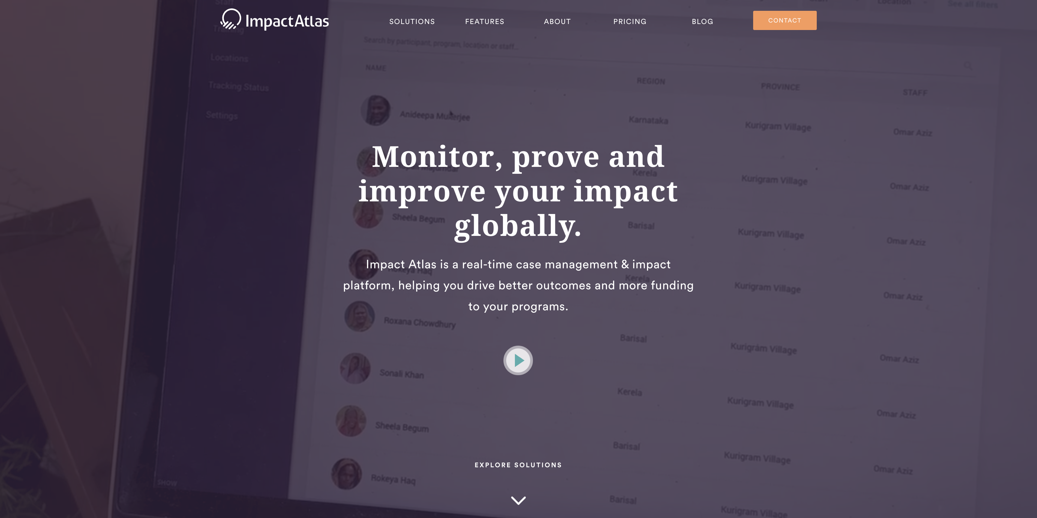
Impact Atlas marketing page showing visualization in the background.
Participant tracking ran entirely on paper, carried house to house — it worked, but didn't scale across a hierarchy of four roles each needing a different view of the same data.
Built for Amplifier Strategies, digitizing a program running BRAC's Ultra-Poor Graduation approach.
This was also where a principle got sharpened: when direction kept changing, waiting for clarity wasn't a strategy — I started getting answers myself, and that's shaped how I work since.
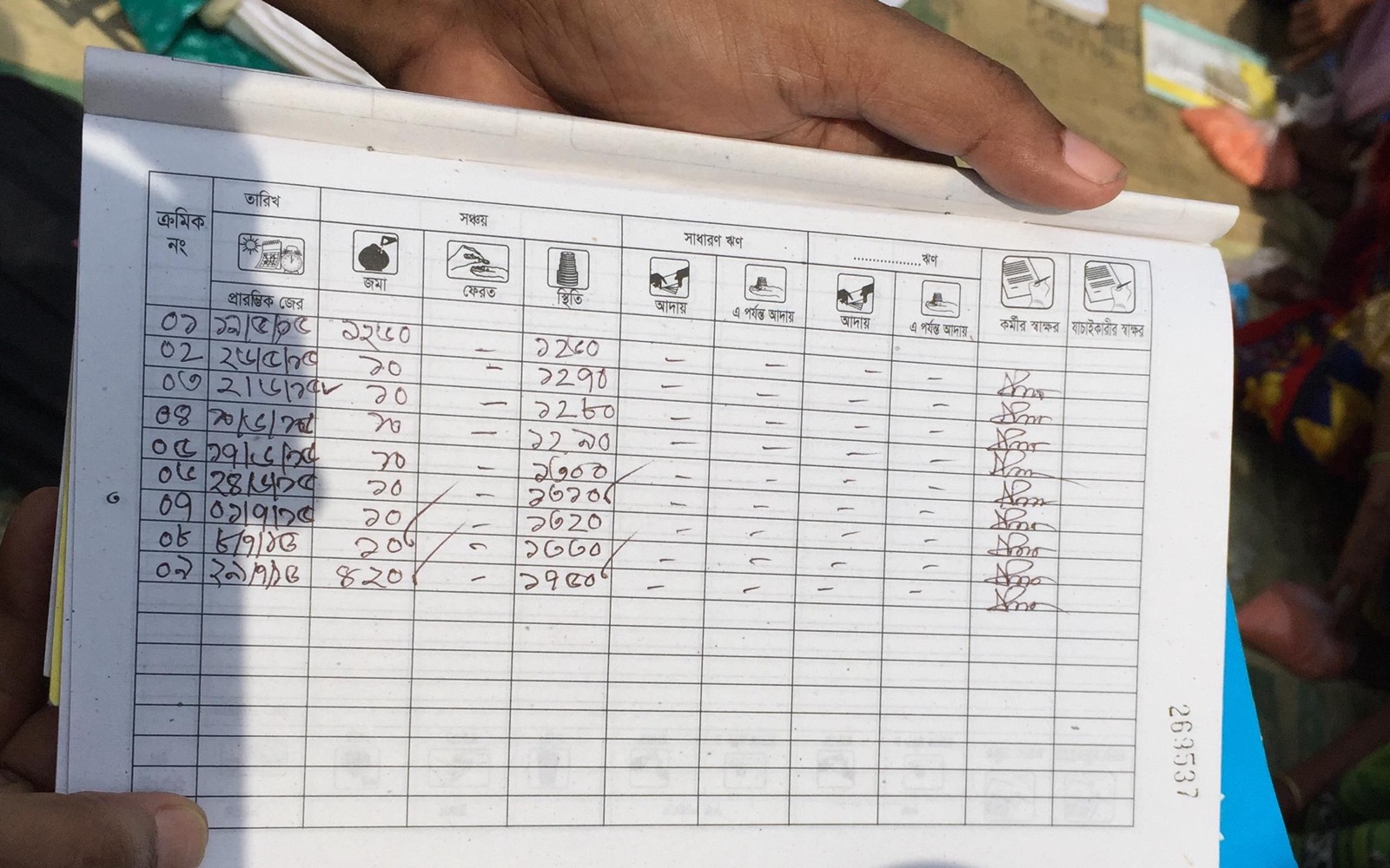
The system before Impact Atlas: a handwritten paper form, tracked house to house.
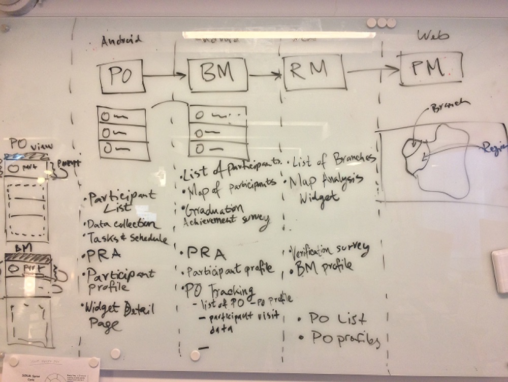
The paper process already encoded a working hierarchy: Program Organizer collects, Branch Manaager verifies, Regional Manager analyzes, Finance Manager oversees.
Digitizing it meant preserving that real structure, not redesigning how the program worked.
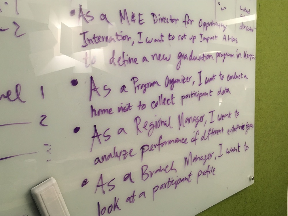
Role-specific views, built directly from the user stories each role already lived by.
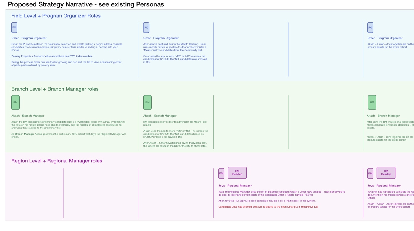
Role-specific views, mapped from the journey: click to open full PDF
Research started from the paper system already in use (weekly visit schedules, means-test forms, hand-tallied participant ledgers filled out in the field) and from direct conversation with the team about who needed to see what.
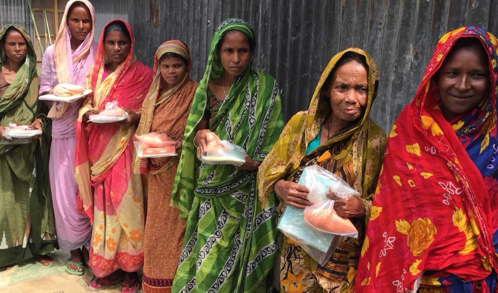
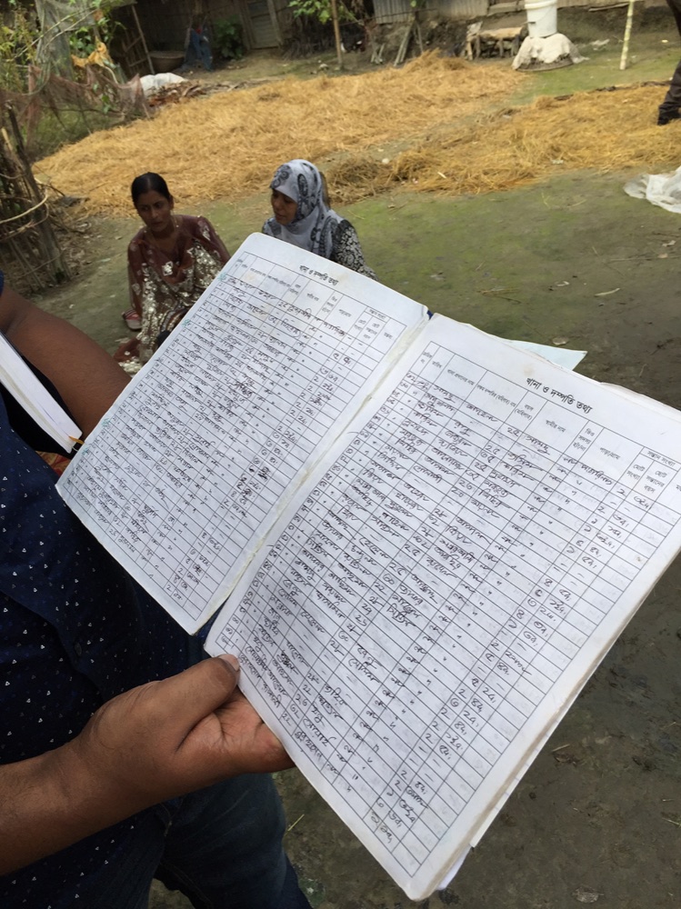
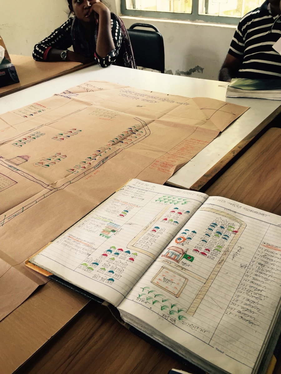
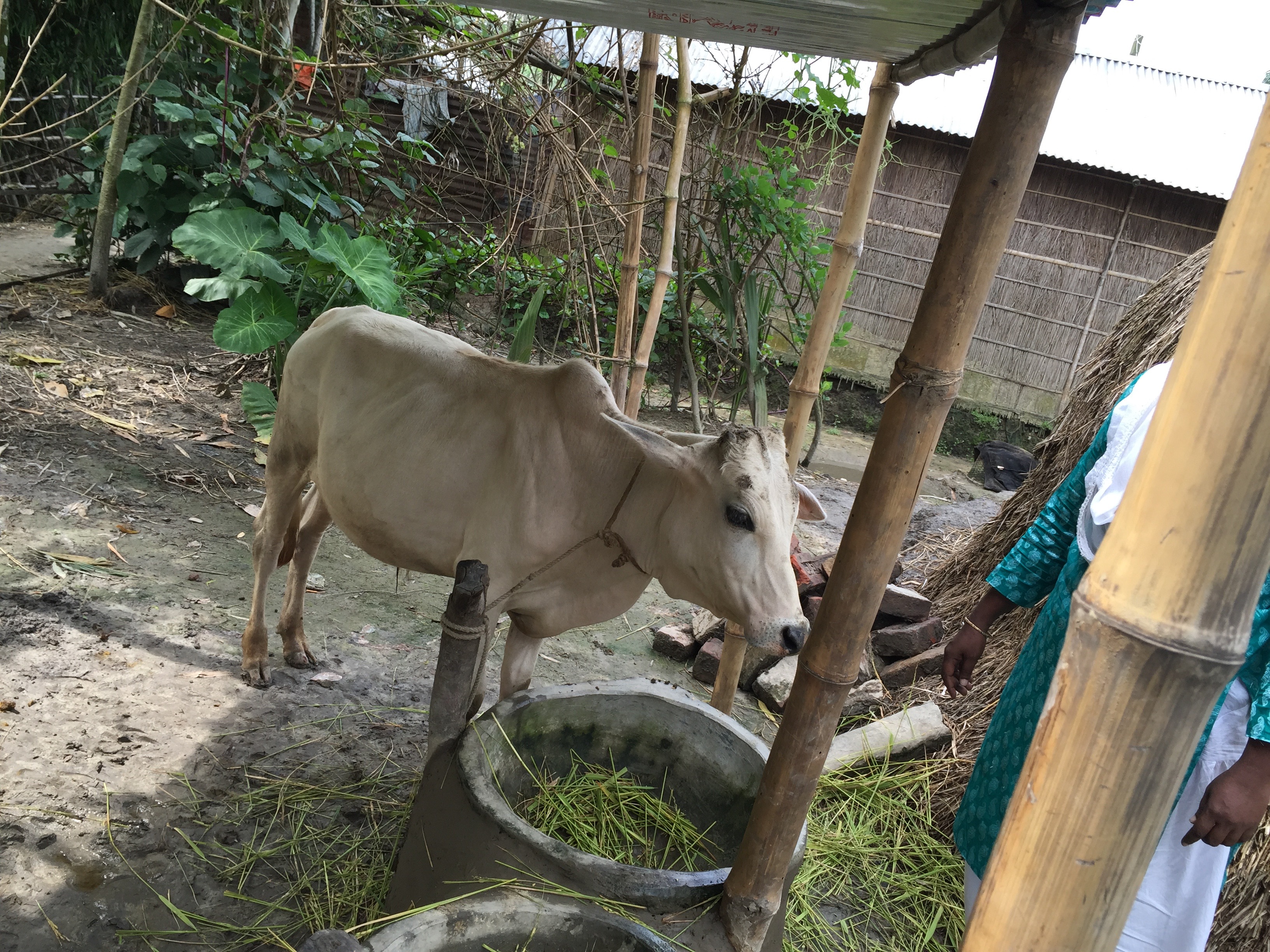
All field photos shot by me during the original program visits.
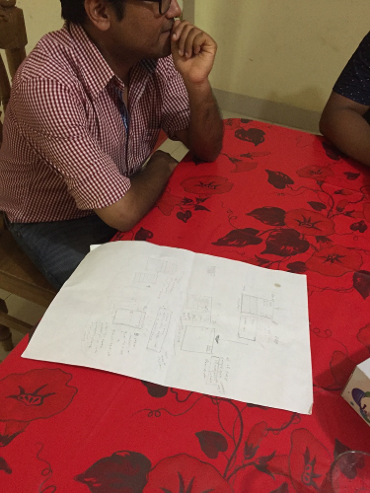
Unlike the other case studies here, this one started on paper: a hand-drawn participant profile sketch, before any digital tool touched it.
User stories went role by role on a whiteboard, then a role/data architecture, then annotated wireframes with edge cases called out directly on the frame.
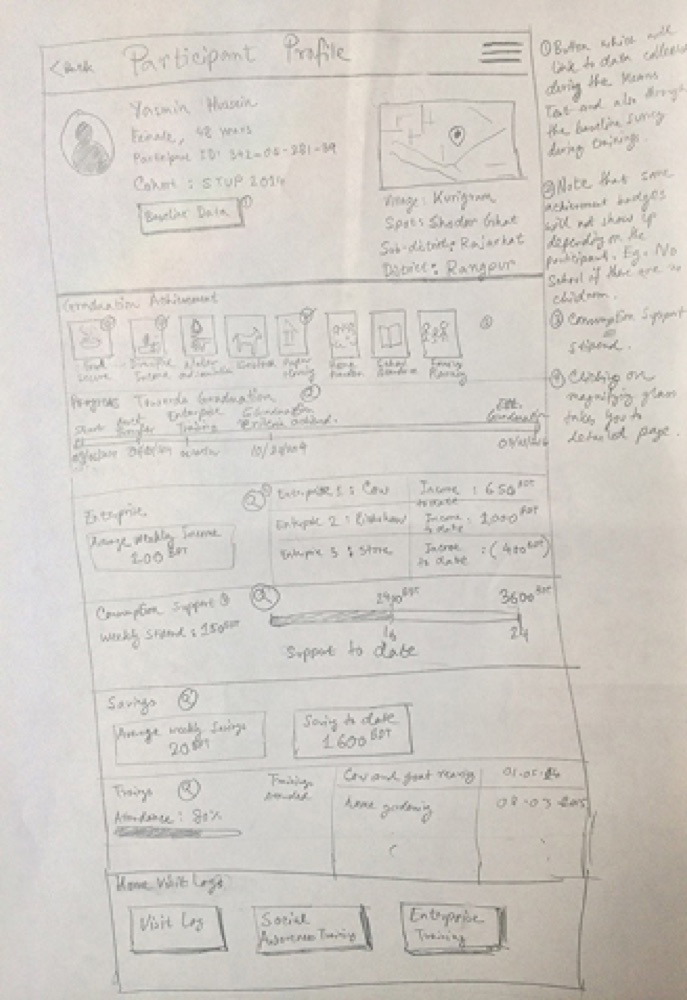
From there, sketches became annotated wireframes: each screen tagged with the role it belongs to, edge cases called out directly on the frame, desktop and mobile covered separately, through to a look at where it landed.
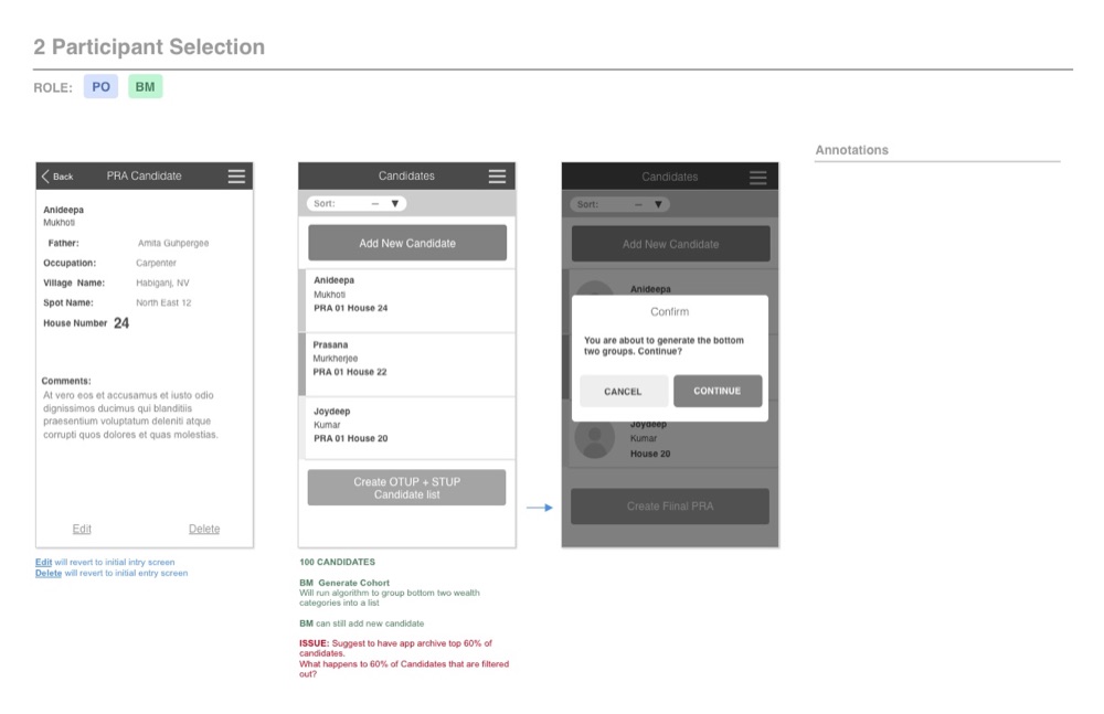
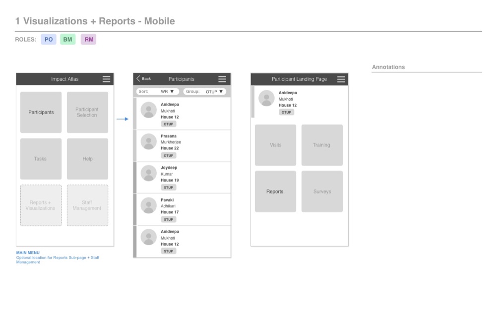
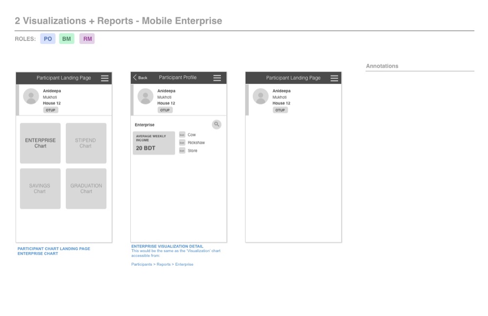
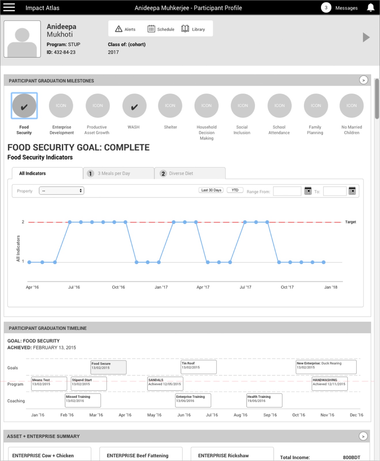
My work carried through the journey map, wireframes, and a fully interactive Axure prototype, validated and tested before I left.
The team took it to final production after that: a participant profile view tracking graduation across 10 milestones, deployed across desktop, tablet, and mobile, localized into French and Arabic alongside English.
That's the real gap between my last deliverable and the finished screenshots below: a handoff, not one unbroken build.
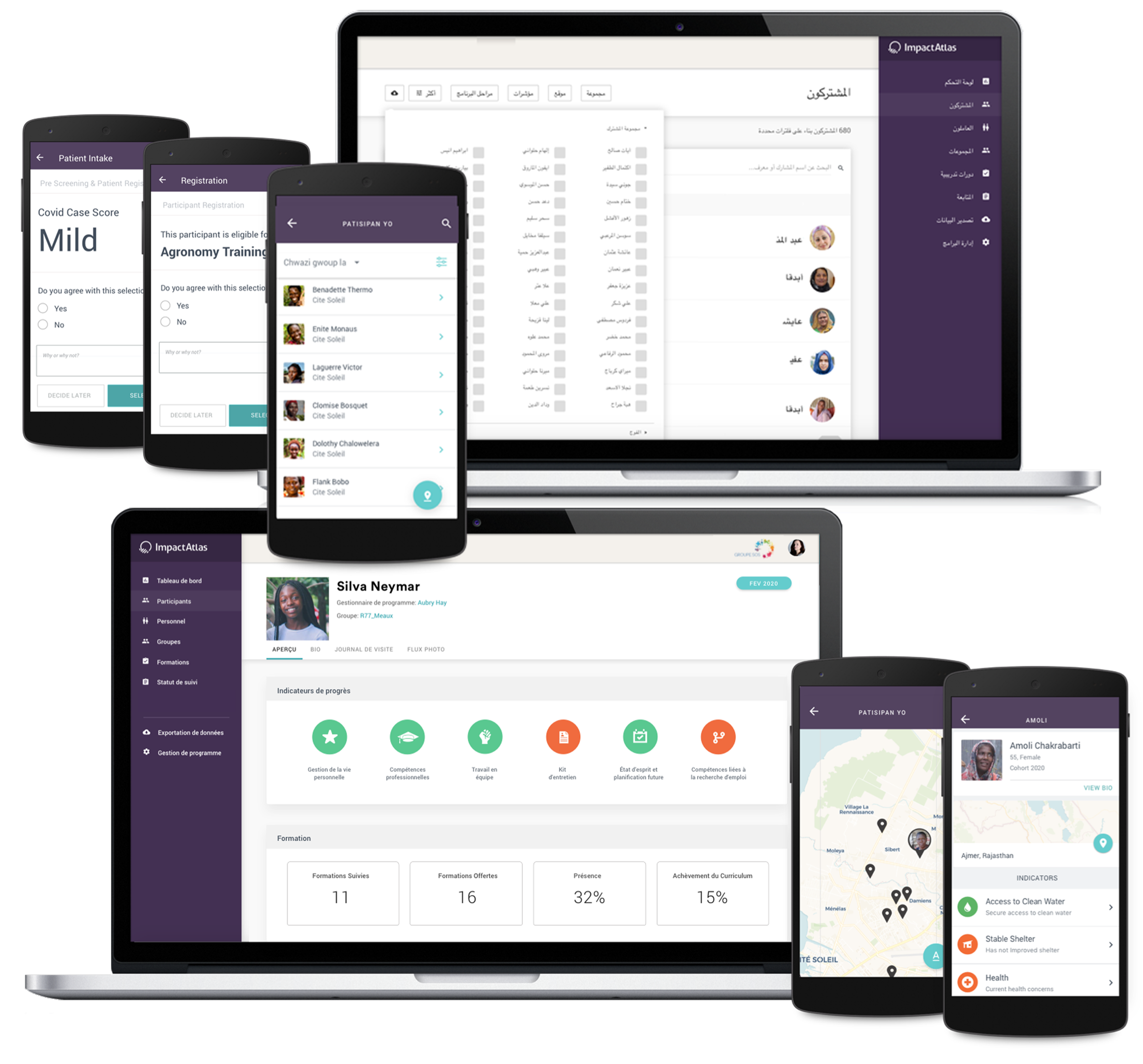
Impact Atlas was built for a program running BRAC's Ultra-Poor Graduation approach — a strong track record (95% lift out of extreme poverty, 93% still showing gains a decade later), though those are results from the program's methodology, not the tool itself.
The tool's own value was structural: a paper process only one person could see at a time became role-specific views four levels of a hierarchy could act on at once.
Same data, finally legible to everyone who needed it, not just whoever was holding the ledger that day.
- Systems Design
- Social Impact
- Enterprise